
Veronese green. Viridian. Perylene Green. Turquoise.
The names of the colours are jotted on carefully torn newsprint pinned to the artist’s studio wall, alongside a make-do colour chart of pigments by Holbein, Williamsburg, Gamblin, Winsor & Newton. One manufacturer’s terra rossa is not the same as the next.
Beneath the newsprint are pictures cut from slick interior design magazines dating to the 1960s. A bedroom is decorated entirely in green: a blue-green canopy over a bed with soft green sheets and a teal headboard, grass-green carpet, a bedside table dressed in the same blue-green fabric as the bedcurtains. Another spread shows a fern-green patterned wallpaper, flat green bedspread, and a potted fern in the window between lacy white curtains (“Decorator, Marian Quinlan, A.I.D.”).
The notes and pictures comprise something like an archaeological excavation into domestic space through colour. Perhaps more precisely, it is an excavation into colour. It doesn’t translate easily into words. Naming a colour is a betrayal of its saturation, hue and tone, its sensuousness and tangibility. All of those greens are not the same. Even the paint manufacturers can’t get it right.
Excavating colour is critical to Adrienne Dagg’s new body of work in progress. This in some respects is not surprising for an oil painter––and to be sure, it is not in fact a new point of departure for her. What is new is the nature of the excavation. For it is in a sense two excavations, doubled. The first is into the indoors-ness of colours from half a century ago (something Dagg has long been engaged with and thinking about). The second is how those colours slowly take form and shape, as if the artist were replicating the process of digging into the spatial depths of the past to reveal them in the present. The colours are layered, built up, glazed as if protectively covered with a skin, flatly patterned, and then sanded away, penetrated, ground from the canvas.
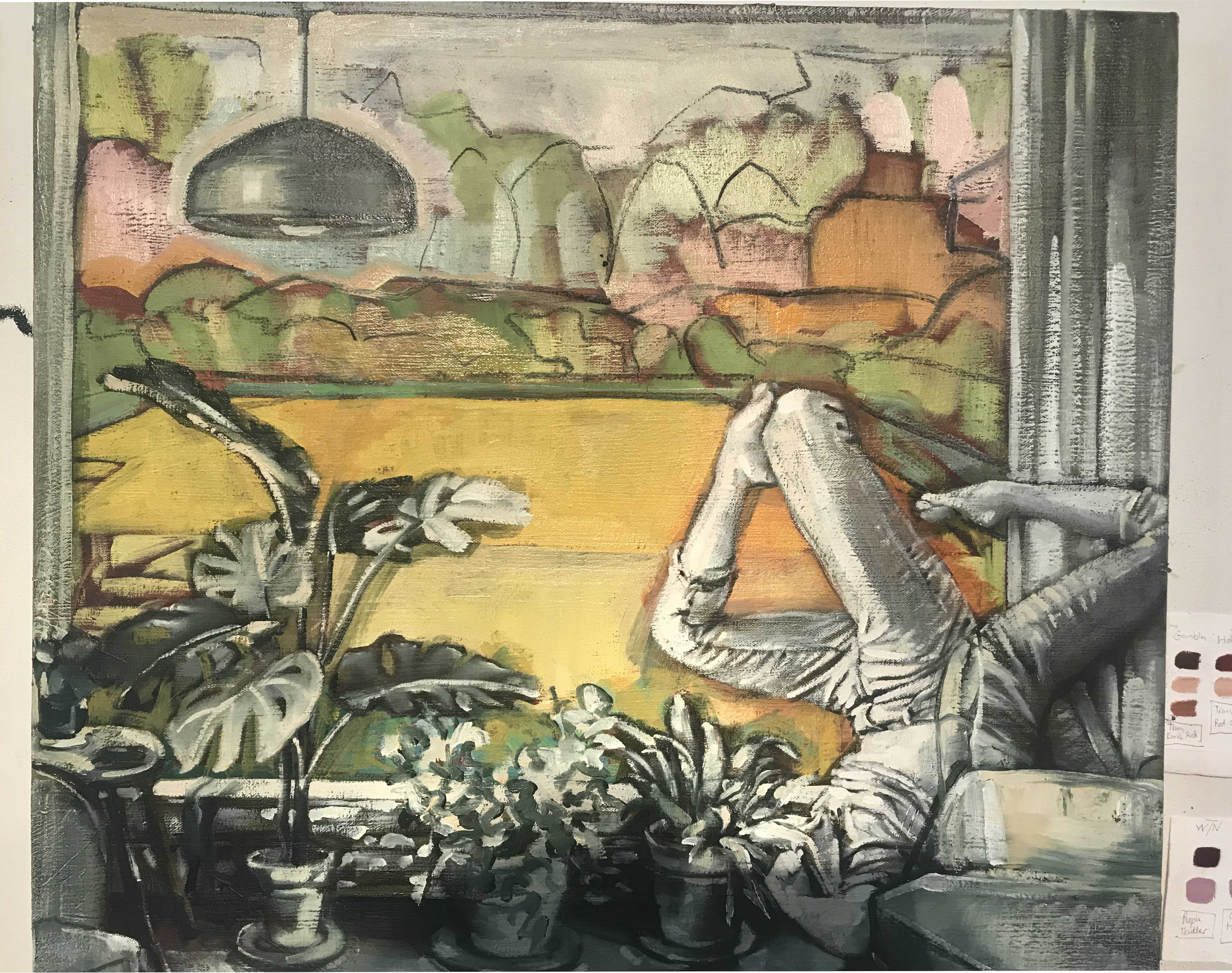
One work in progress, for instance, shows palms, potted plants, and two prone figures with legs raised in the air beneath a pendant lamp (which does not illuminate so much as it casts the strangeness of blue electric light against the diffused natural light of a large picture window). What can be seen through the window is bright (yellow-orange, chartreuse, mauve) but solidly indeterminate, sliding between the forms of lumpy trees or rounded hedges and the firm set of charcoal marks used to render them (“though they’re not archival,” the artist observes, which is entirely in keeping with the project of excavating colours that are not durable culturally). The whites are isolated and deepened by glaze. We can see through them to the nub of the canvas.
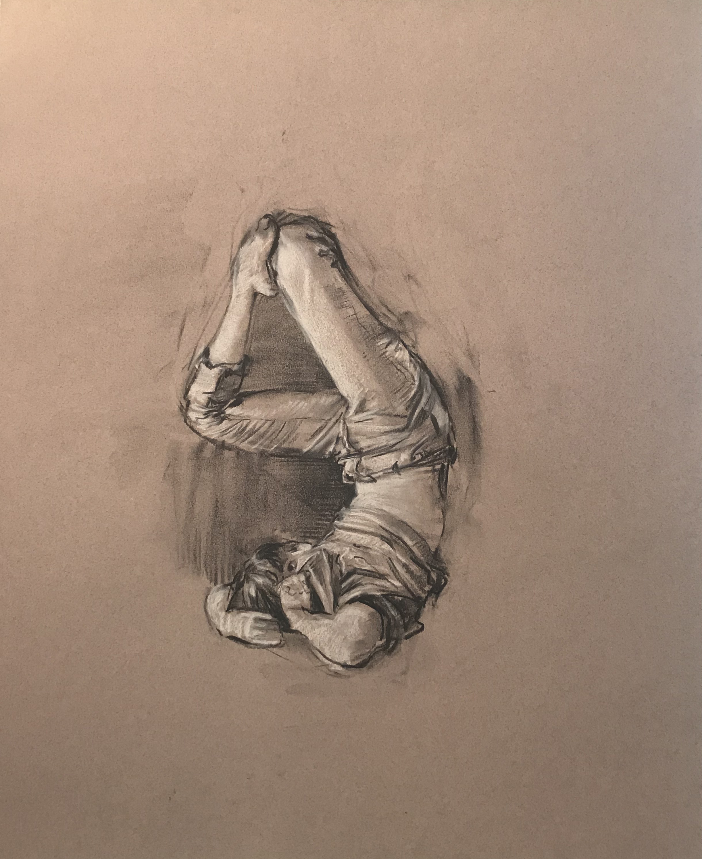
There’s more to it. The pictorial space, of course, replicates home décor from one of those magazines. Its immediacy–in spite of the out-of-dateness of the colours–is animated (re-animated) by the figures that populate it. They are gracefully contorted, and real, based on drawings of the performance artist Stephanie Patsula Palmer in motion. The poses convey awkwardness and grace: her body rests in shapes that are somehow relaxed, contemplative, and uncomfortable. Dagg renders the figures anonymous (as she does in all of her canvases). They turn away from the beholder, faces hidden behind a couch pillow (and in other paintings by a drape of hair or a leafy plant). She highlights Palmer’s androgyny. The figures could be anyone.
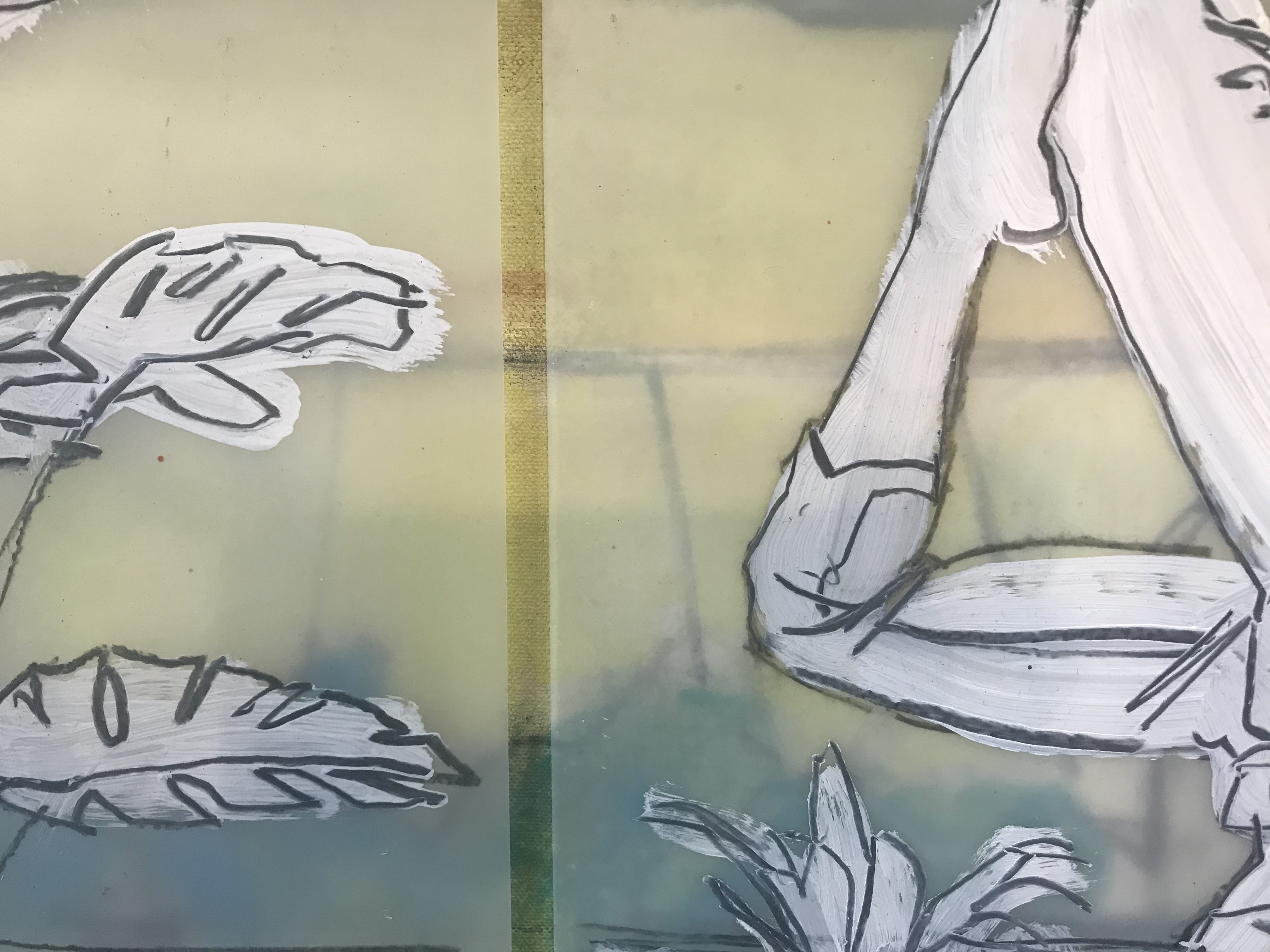
The figures are real and in this world, but they also are not of it. Their strange presence has to do with the colour. After sketching Palmer in pastels, Dagg transfers the figures to mylar through quick charcoal strokes over white paint. On mylar they become ghost-like and two-dimensional. Echoing the performativity of Palmer’s poses, Dagg tapes the mylar to a draft canvas, then moves it around, retapes it, assessing how the figures inhabit the space. She renders them a third time in paint, trying to capture some of that gray-whiteness of the mylar’s transparency tinged with the colours behind it. Which is to say, she shows us colour through a figure.
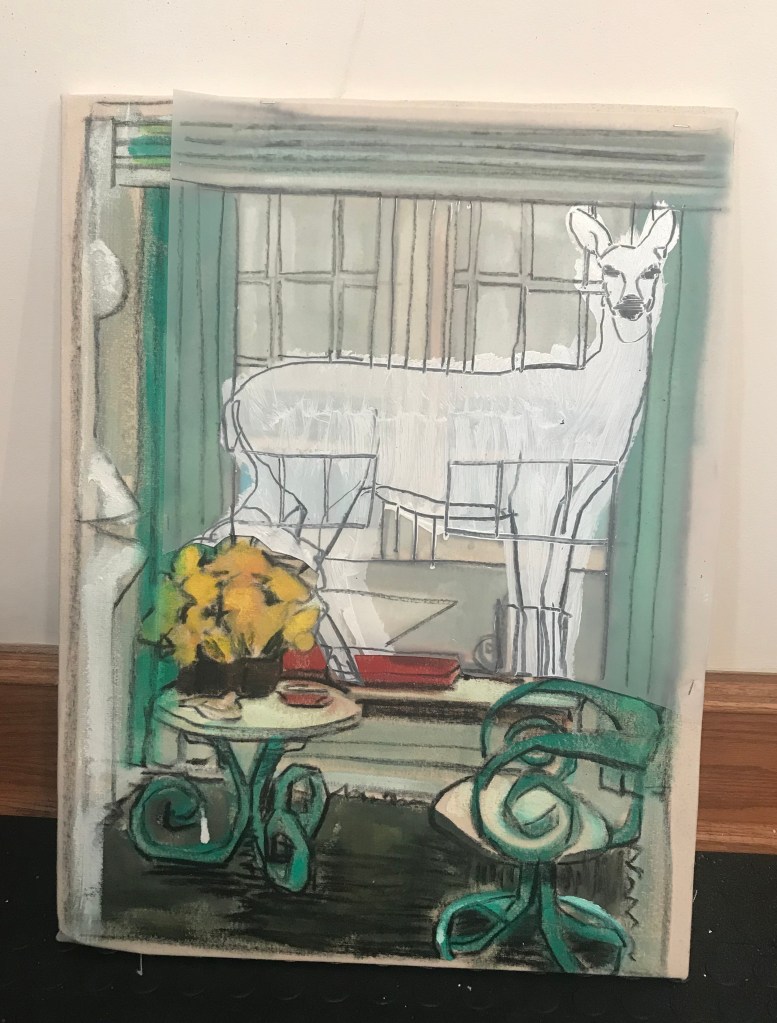
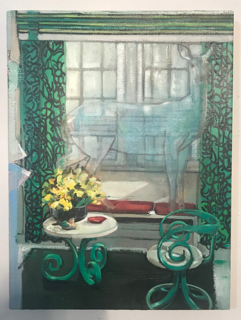
This effect of the figures being real and not quite there (but paradoxically belonging to the space precisely because of their spectre-like see-through quality) is even more clear in a painting of a deer in a living room (roosters, chickens, and other animals also find their way into Dagg’s canvases). Through the thick but eroded surface of the mint greens and blue-whites of the deer’s body (the colour of invisibility), we can see the window frames.
Dagg’s synthesis of a realist style with creamy rich colour refracted through light and figures might prompt the question: Is this twenty-first century post-impressionism? A comparison for one of Dagg’s finished paintings, Luncheon in Room 206 (2021), is suggested by the picture within it, Manet’s Déjeuner sur l’herbe (1862-63). Art historian Michael Fried writes of the Déjeuner that “the painting itself is conceived as a kind of tableau vivant,”
but a tableau vivant constructed so as to dramatize not a particular event so much as the beholder’s alienation from that event. Moreover, in paintings like the Dejeuner… for example, the inhibiting, estranging quality of self-awareness is literally depicted within the painting: in the Dejeuner by the unintelligible gesture of the man on the right and the bird frozen in flight at the top of the painting… (1998, 261, n. 4).
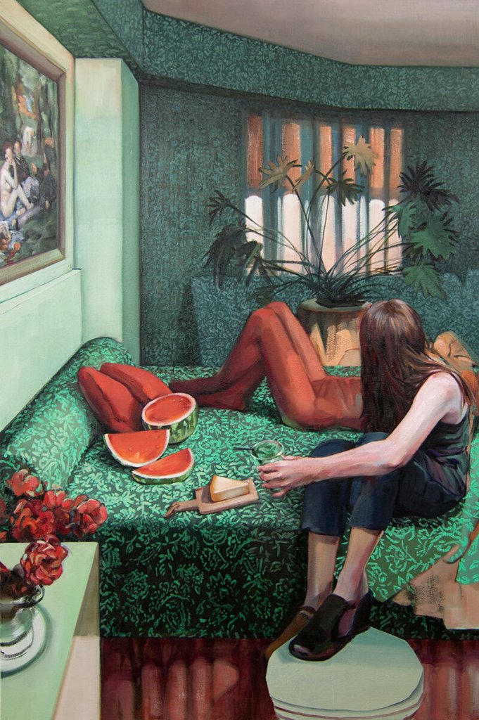
Luncheon in Room 206 likewise is a tableau vivant: two still figures on a fully made bed picnic on watermelon and brie beneath the Déjeuner. Luncheon is formally grounded in the same impulse that guided Manet to put life on canvas (that fleshy arm) and luxuriates in colour the same way (those greens and reds) and what is more, in terms of content, similarly depicts not only a picnic but unintelligible gestures (the faces are turned away). Still, Dagg’s painting works in the opposite direction. Its effect is not an inhibiting, estranging quality of self-awareness. This is not a painting embodying alienation. It is a painting about relationships.
Why is that? Partly it’s that sense of the past in the very pigment of the painting. It is so familiar we don’t register it. It is visible in the green-on-green wallpaper, the red cushions on the bed, the dusty orange and green (plastic?) palm in front of the lightless window. Which is to say, the excavation into colour provokes a low-level, garden-variety recognition. We’ve seen those colours before, we’ve been in Room 206. Even more, though, it’s because of those figures. They are connected, so that the one rendered flatly in reds is as if an extension of the figure in black holding the glass. There is a story about a relationship being told here. Like the Déjeuner, it is only hinted at. But because of their anonymity and our connection to the interiority of the space we share with them, that story turns out to be one that we as beholders might make up as we stand before the painting. It might even feature us. Through our story-telling their relationship can become our relationship, and that sense of recovering something new through colour, our own.
Fried, Michael. (1998). “Three American Painters: Kenneth Noland, Jules Olitski, Frank Stella (1965).” In Art and Objecthood: Essays and Reviews, pp. 213-65. Chicago: University of Chicago Press.
